Customize Styles
For now you can use the --css flag to specify custom CSS and override the font and color variables.
The CSS is injected in the UI, also when embedding.
There are separate colors for light and dark mode.
To disable dark mode, set the dark-mode variables to the same value as the light mode variables.
These are the default values:
:root {  --shaper-font: DMSans;  --shaper-display-font: SourceSansPro;  --shaper-reference-line-color: #b5b5b5;
  --shaper-color-two: #7ca7d4;  --shaper-color-three: #ffaaaa;  --shaper-color-four: #e0297a;  --shaper-color-five: #f5b067;  --shaper-color-six: #67b983;  --shaper-color-seven: #c4c4c4;
  --shaper-primary-color: #4c68bf;  --shaper-primary-color-alternate: #3955ac;  --shaper-text-color: #3d3f45;  --shaper-text-color-secondary: #545964;  --shaper-text-color-invert: #fff;  --shaper-text-color-button: #fff;  --shaper-background-color: #fff;  --shaper-background-color-secondary: #f6f8fa;  --shaper-background-color-alternate: #e8e8ef;  --shaper-background-color-invert: #353d4b;  --shaper-border-color: #d6d8fa;  --shaper-error-color: #df4f56;  --shaper-error-color-alternate: #ce474d;
  --shaper-dark-mode-primary-color: #4f6dcc;  --shaper-dark-mode-primary-color-alternate: #657fd3;  --shaper-dark-mode-background-color-secondary: #28252e;  --shaper-dark-mode-text-color: rgb(239, 240, 244);  --shaper-dark-mode-text-color-secondary: rgb(215, 216, 221);  --shaper-dark-mode-text-color-invert: #171924;  --shaper-dark-mode-text-color-button: #fff;  --shaper-dark-mode-background-color: #3a3b48;  --shaper-dark-mode-background-color-secondary: #424453;  --shaper-dark-mode-background-color-alternate: #585a72;  --shaper-dark-mode-background-color-invert: #f5f5f5;  --shaper-dark-mode-border-color: #777985;  --shaper-dark-mode-error-color: #ca4a56;  --shaper-dark-mode-error-color-alternate: #e85260;}
Since this is just CSS, you can also overwrite this from within the host application when embedding. This keeps you flexible to adjust the look for different use cases served by the same Shaper instance.
Chart Watermarks
Section titled “Chart Watermarks”You can add a watermark to charts when users download them via the download button. This helps users credit you more easily when they are using a chart for a presentation or similar.
Specify an image URL as CSS variable to configure the watermark. You can also use data URLs, for example:
:root { --shaper-watermark-url: url('data:image/png;base64,...');}We recommend using a transparent image with a height of at least 34px.
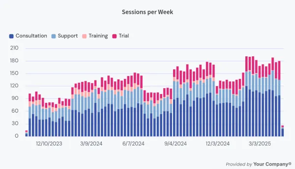
Example:
Note that the watermark is added to the image in the bottom right below the chart. It’s not a watermark in the sense that it overlays the whole chart. The intention is not to make it impossible for users to “steal” the chart, but to help users who want to credit you.