Dashboard SQL Reference
For an overview of available visualizations and features, see the Feature Demo Board.
Dashboards are expressed as SQL queries. Each query defines a UI element. Queries are separated by ;.
All SQL is valid DuckDB SQL. For more, look at the DuckDB SQL docs.
Shaper creates custom SQL types. You can cast your data to these types to render the data differently. The simplest way to cast a column’s type is by appending the type with ::, for example SELECT 'hello'::LABEL.
This can be used to control the data visualization, add filter options and control the dashboard layout.
Tables
Section titled “Tables”Data is rendered as table by default. Column names are used as table headers.
PERCENT
Section titled “PERCENT”SELECT mynumber::PERCENT AS percent;Renders a DOUBLE as a percentage value. Your numbers should probably be between 0 and 1.
Show a trend indicator as a table column:
SELECT 10 AS "this week", 5 AS "last week", (10 / 5)::TREND AS "change";The change column will show “100%↑”.
Single Value
Section titled “Single Value”SELECT 'hello world';If a query returns a single row and a single column, it is rendered as a big single card.
The font size is adjusted automatically to fit the content onto screen.
If you want to ensure that even short text is aligned on the left you can end the text with a newline:
SELECT 'hello world';PERCENT
Section titled “PERCENT”SELECT 0.33::PERCENT AS percent;Renders a DOUBLE as a percentage value. Your numbers should probably be between 0 and 1.
COMPARE
Section titled “COMPARE”Show a comparison value below the value and a trend indicator:
SELECT 10 AS "this week", 5::COMPARE AS "last week";This will show last week: 5 [100%↑] below the value.
TEXT_SMALL, TEXT_MEDIUM, TEXT_LARGE
Section titled “TEXT_SMALL, TEXT_MEDIUM, TEXT_LARGE”Manually control the font size of single text values. Shaper tries to scale font sizes as reasonably as possible depending on screen space and content length. But sometimes you want to override it - especially if you want multiple single value cards to have the same font size even with different content lengths.
SELECT 'This is a small text'::TEXT_SMALL;SELECT 'This is a medium text'::TEXT_MEDIUM;SELECT 'This is a large text'::TEXT_LARGE;Bar Chart
Section titled “Bar Chart”To render a bar chart you need to specify along which axis to render the chart and how to plot the values. Additionally you can group the data by a category.
Any additional columns will only be visible in the tooltip on hover.
Example:
SELECT time::XAXIS, value::BARCHART, category::CATEGORY FROM my_tableXAXIS, YAXIS
Section titled “XAXIS, YAXIS”You can render a bar chart along the x-axis or y-axis.
Often you will be using a timestamp as the axis column.
The axis column must be a VARCHAR, TIMESTAMP, TIME or number type.
BARCHART
Section titled “BARCHART”Mark the column as BARCHART that you like to display as value of the bars in the chart.
This must be a numeric value or INTERVAL.
CATEGORY
Section titled “CATEGORY”Mark a VARCHAR column as category to render multiple bars for each point on the axis.
This will also display a legend for the categories in the chart.
When CATEGORY is set to NULL or an empty VARCHAR then the category will not show up in the legend.
This is useful to only change bar colors or to only label specific bars in a chart.
For example:
SELECT 'Would you recommend the product to a friend?'::LABEL;SELECT col0::XAXIS, col1::BARCHART_STACKED_PERCENT, col2::CATEGORYFROM ( VALUES (5, 0.7, 'Fully recommend'), (4, 0.025, NULL), (3, 0.1, NULL), (2, 0.025, NULL), (1, 0.15, 'Would not recommend'),);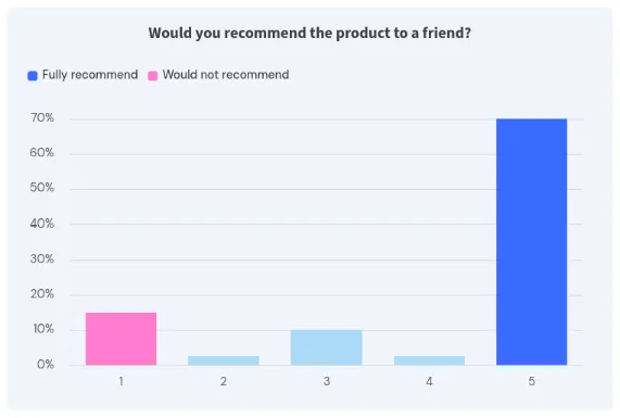
BARCHART_STACKED
Section titled “BARCHART_STACKED”When using CATEGORY you can change BARCHART to BARCHART_STACKED to render categories as a single, stacked bar instead of rendering multiple bars.
BARCHART_PERCENT
Section titled “BARCHART_PERCENT”Use BARCHART_PERCENT or BARCHART_STACKED_PERCENT to show the value of the chart as percentage.
This sets the max value of the chart to 100%.
The values should most likely be between 0 and 1.
Specify a color for each category:
SELECT count()::BARCHART_STACKED, date_trunc('quarter', created_at)::XAXIS AS "Quarter", category::CATEGORY, color::COLORFROM sessions LEFT JOIN cat_colors USING (category)GROUP BY ALL ORDER BY ALL DESC;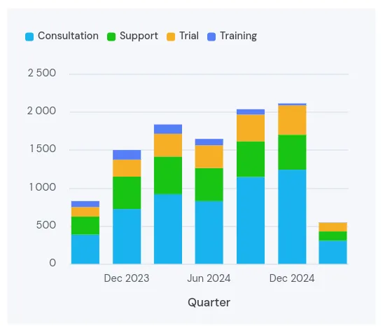
The last color value for each category is used. And if no color is specified, the default color is used.
We recommend storing colors as table to be able to reuse them across dashboards.
For the above example you could add this to your init.sql file:
CREATE OR REPLACE TABLE cat_colors AS ( SELECT col0 AS category, col1 AS color FROM ( VALUES ('Consultation', '#19b2ee'), ('Support', '#18c413'), ('Trial', '#f7af26'), ));If you only want to reuse colors in a single dashboard, use a temporary table instead.
You can also specify a custom color for a chart without categories:
SELECT count()::BARCHART, date_trunc('quarter', created_at)::XAXIS AS "Quarter", '#f7af26'::COLORFROM sessions GROUP BY ALL ORDER BY ALL DESC;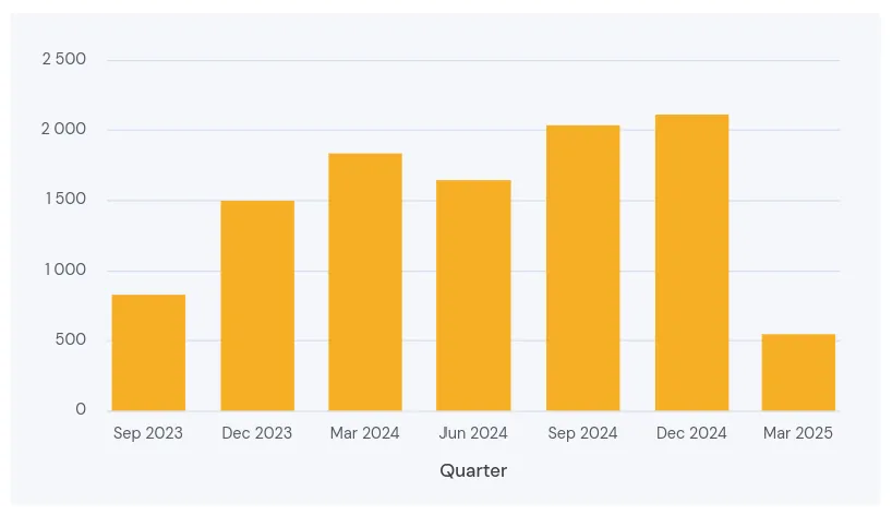
Line Chart
Section titled “Line Chart”Line charts work almost identical to bar charts, but they don’t have the YAXIS and _STACKED options.
Specify the column to use as x-axis. Most likely this will be a time dimension.
LINECHART
Section titled “LINECHART”Specify which column to show as value (numeric or INTERVAL)
CATEGORY
Section titled “CATEGORY”Optionally add a column category to render multiple lines in the line chart
LINECHART_PERCENT
Section titled “LINECHART_PERCENT”Render the value of the chart as percentage. This sets the max value of the chart to 100%. The values should most likely be between 0 and 1.
Specify a color for each category. Works the same as for bar charts (see above).
Box Plots
Section titled “Box Plots”Box and Whisker plots are useful for quickly visualizing the distribution of a dataset, comparing multiple groups, and identifying outliers.
Specify the column to use as x-axis.
BOXPLOT()
Section titled “BOXPLOT()”SELECT col0::XAXIS, BOXPLOT(col1)FROM ( VALUES ('One', 10), ('One', 20), ('One', 30), ('One', 40), ('One', 50), ('Two', 15), ('Two', 25), ('Two', 40), ('Two', 45), ('Two', 65),)GROUP BY col0, ORDER BY col0;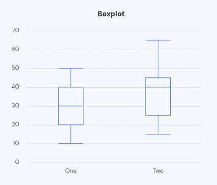
Unlike other Shaper features box plots use a custom function instead of type casting.
This is because the BOXPLOT() function is an aggregate function (similar to for example AVG())
that automatically calculates the statistics needed to draw a box plot (min, max, median, Q1, Q3).
With Outliers
Section titled “With Outliers”You can pass a MAP as optional parameter to BOXPLOT() to show a box plot with outliers instead:
SELECT col0::XAXIS, BOXPLOT(col1, outlier_info := MAP {'Customer': col2})FROM ( VALUES ('One', 10, ''), ('One', 20, ''), ('One', 30, ''), ('One', 40, ''), ('One', 50, ''), ('One', 90, 'Unicorn Inc.'), ('Two', 15, ''), ('Two', 25, ''), ('Two', 40, ''), ('Two', 45, ''), ('Two', 65, ''),)GROUP BY col0, ORDER BY col0;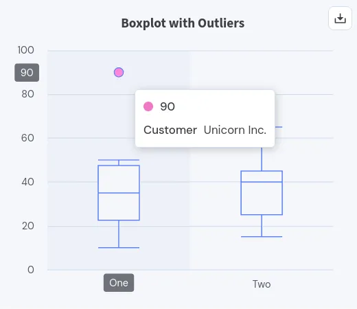
The key-value data in the MAP will be shown when a data point is marked as outlier and the user hovers over that outlier.
Use this to identify outliers and take action.
Pass an empty map MAP {} if you don’t have any extra info to show and simply want to display outlier points.
Outliers are defined as values falling outside the 1.5 IQR (Inter-Quartile Range).
When showing outliers, the min and max are the most outer values in the dataset that are still within the 1.5 IQR.
Specify a color for box and its outliers. Works similar to bar and line charts above.
Chart Annotations
Section titled “Chart Annotations”You can draw mark lines on charts to explain specific values. This works for, both, bar charts and line charts. Use this to mark events on a timeline or indicate certain value thresholds.
You specify these annotations with a separate SELECT query before the actual chart query.
The query can return multiple rows to draw multiple annotations.
If you want to draw horizontal and vertical lines in the same chart, you can specify multiple annotation queries before the chart query.
Use XLINE to draw a vertical line at a specific point on the x-axis.
SELECT 'My Timeline'::LABEL;SELECT col0::TIMESTAMP::XLINE, col1::LABELFROM ( VALUES ('2025-09-23', 'Black Friday Outage'), ('2025-09-27', 'Thanksgiving'));SELECT col0::TIMESTAMP::XAXIS, col1::BARCHART,FROM ( VALUES ('2025-09-02', 10), ('2025-09-16', 20), ('2025-10-10', 30),);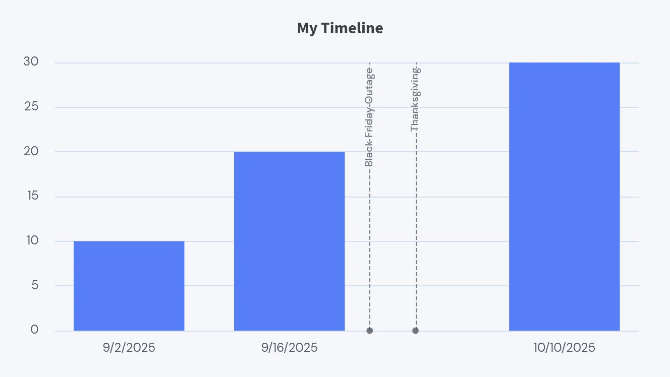
Use YLINE to draw a horizontal line at a specific value on the y-axis.
Note that YLINE does not work for vertical bar charts (charts that use YAXIS).
SELECT 'Customer Satisfaction'::LABEL;SELECT 85::YLINE, 'Average'::LABEL;SELECT col0::DATE::XAXIS, col1::LINECHARTFROM ( VALUES ('2023-01-01', 98), ('2023-07-01', 89), ('2024-01-01', 92), ('2024-07-01', 91), ('2025-01-01', 70), ('2025-03-01', 65), ('2025-05-01', 80));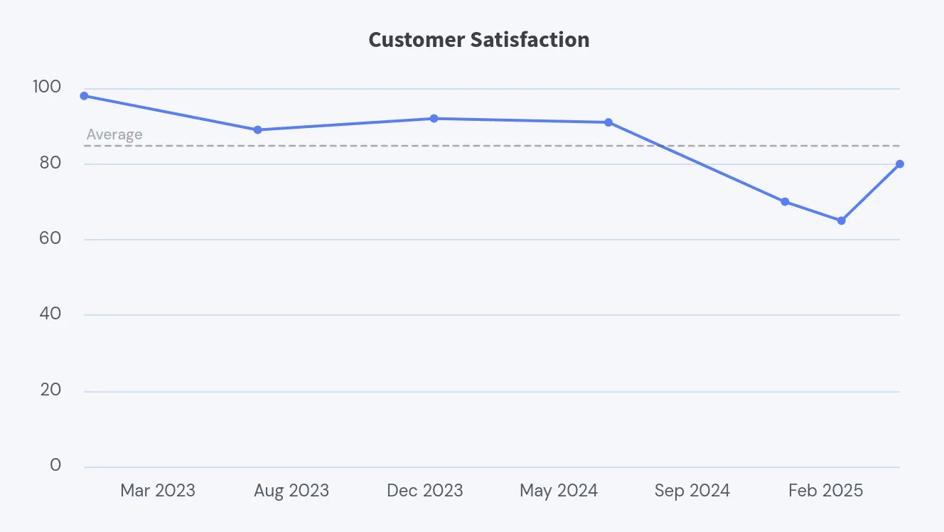
In addition to XLINE and YLINE you can specify a LABEL as separate column in the same query to show a label next to the line. Otherwise, the value is shown as label.
Use a gauge to visualize a single value as progress towards a goal or to indicate a status across categories.
A range query must return a single row with a column marked as GAUGE.
Use RANGE to specify the range of the gauge:
SELECT 4::GAUGE, [0, 10]::RANGE;GAUGE_PERCENT
Section titled “GAUGE_PERCENT”To render a gauge that shows a percentage, use GAUGE_PERCENT.
If the value falls within 0 and 1 (0% to 100%), you can skip specifying the RANGE.
SELECT 'CPU Usage'::LABEL;SELECT 0.22::GAUGE_PERCENT;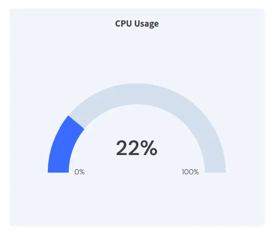
RANGE, LABELS, COLORS
Section titled “RANGE, LABELS, COLORS”To show a status across multiple categories, you can specify more than two range values.
Once you do that you most likely also want to set specific colors for each category using COLORS.
And you can display a label for each category using LABELS.
Note that the LABELS and COLORS lists contain one less element than the RANGE list.
SELECT 'Score'::LABEL;SELECT 75::GAUGE, [0, 33, 66, 100]::RANGE, ['#ee5674', '#ffd26a', '#6cbc87']::COLORS, ['Bad', 'Okay', 'Good']::LABELS;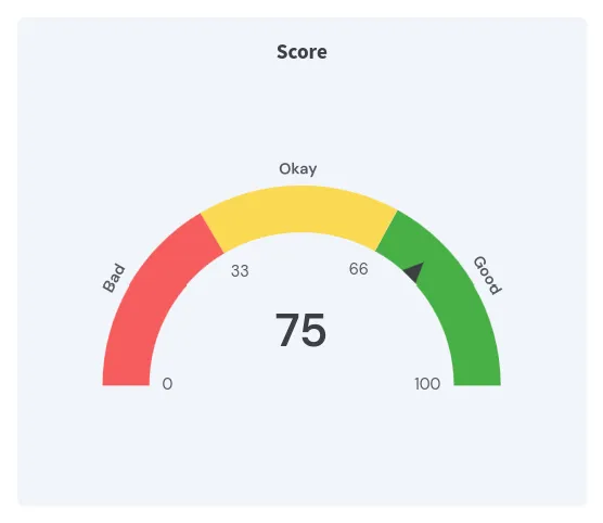
Pie Chart
Section titled “Pie Chart”Use pie charts to give a quick overview of data distribution across categories when the relative size is more relevant than the absolute values.
Additional columns are shown in the tooltip on hover.
SELECT 'Visitors by Country'::LABEL;SELECT col1::PIECHART AS "Visitors", col0::CATEGORYFROM ( VALUES ('US', 5728), ('DE', 2854), ('CN', 2152), ('IN', 2044), ('UK', 1102), ('FR', 688),);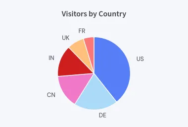
PIECHART
Section titled “PIECHART”Mark the column to use as value of the pie chart. This must be a numeric value.
CATEGORY
Section titled “CATEGORY”Mark a VARCHAR column as category to render multiple slices in the pie chart.
If there are more than one category that is smaller than 5% of the total value, these categories are grouped as “Other”.
PIECHART_PERCENT
Section titled “PIECHART_PERCENT”Use PIECHART_PERCENT instead of PIECHART to pass percents directly instead of absolute values.
Specify a color for each category:
SELECT 'Visitors by Country'::LABEL;SELECT col1::PIECHART AS "Visitors", col0::CATEGORY, col2::COLORFROM ( VALUES ('US', 5728, '#002868'), ('DE', 2854, '#000000'), ('CN', 2152, '#DE2910'), ('IN', 2044, '#FF9933'), ('UK', 1102, '#C8102E'), ('FR', 688, '#0055A4'),);Donut Chart
Section titled “Donut Chart”Donut charts are very similar to pie charts, but they show the total value in the center of the chart. Use donut charts when both the total value and the distribution across categories are relevant.
SELECT 'Visitors by Country'::LABEL;SELECT col1::DONUTCHART AS "Visitors", col0::CATEGORYFROM ( VALUES ('US', 5728), ('DE', 2854), ('CN', 2152), ('IN', 2044), ('UK', 1102), ('FR', 688),);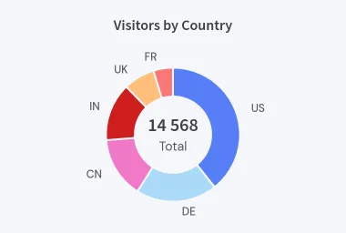
DONUTCHART
Section titled “DONUTCHART”Mark the column to use as value of the donut chart. This must be a numeric value.
CATEGORY
Section titled “CATEGORY”Mark a VARCHAR column as category to render multiple slices in the donut chart.
If there are more than one category that is smaller than 5% of the total value, these categories are grouped as “Other”.
DONUTCHART_PERCENT
Section titled “DONUTCHART_PERCENT”Use DONUTCHART_PERCENT instead of DONUTCHART to pass percents directly instead of absolute values.
Specify a color for each category:
SELECT 'Visitors by Country'::LABEL;SELECT col1::DONUTCHART AS "Visitors", col0::CATEGORY, col2::COLORFROM ( VALUES ('US', 5728, '#002868'), ('DE', 2854, '#000000'), ('CN', 2152, '#DE2910'), ('IN', 2044, '#FF9933'), ('UK', 1102, '#C8102E'), ('FR', 688, '#0055A4'),);Filtering
Section titled “Filtering”Make dashboards interactive by adding filter options to them.
The resulting filter value will be available in all following queries on the dashboard via DuckDB’s built-in getvariable('varname') function.
varname is the column name you specified via AS varname in the filter query.
DATEPICKER
Section titled “DATEPICKER”Create a date picker:
SELECT today()::DATEPICKER AS date;The value (above today()) is the date that is selected by default.
You can use the resulting variable in the following queries with getvariable('date').
The variable is of type DATE.
DATEPICKER_FROM, DATEPICKER_TO
Section titled “DATEPICKER_FROM, DATEPICKER_TO”Create a date range picker:
SELECT (today() - INTERVAL '7 days')::DATEPICKER_FROM AS "from", (today())::DATEPICKER_TO AS "to";The query specifies the default date range and generates two variables from and to;
Use the variables in following queries:
SELECT *FROM mytableWHERE created_at BETWEEN getvariable('from') AND getvariable('TO');DROPDOWN
Section titled “DROPDOWN”Define a drop-down select menu:
SELECT type::DROPDOWN AS typeFROM my_tableGROUP BY typeORDER BY type;The first value is selected by default.
You can use the resulting variable in the following queries with getvariable('type').
The variable is of type VARCHAR.
Make sure to use an ORDER BY clause to control the order of the values in the dropdown.
To add a custom default value, return it as first result of the query.
Use UNION ALL for this:
SELECT 'default'::DROPDOWN AS typeUNION ALL( SELECT type FROM my_table GROUP BY type ORDER BY type);Specify separate label and value for a dropdown:
SELECT EXTRACT(MONTH FROM range)::TEXT::DROPDOWN AS month, strftime(range, '%B')::LABELFROM range(DATE '2024-01-01', DATE '2025-01-01', INTERVAL 1 MONTH)ORDER BY range;This uses a number as value for the dropdown and shows the month name as label.
DROPDOWN_MULTI
Section titled “DROPDOWN_MULTI”Same as DROPDOWN, but allows selecting multiple values:
SELECT type::DROPDOWN_MULTI AS typeFROM my_tableGROUP BY typeORDER BY type;By default all values are selected.
The resulting variable is a list of VARCHAR values.
You can use it with an IN clause:
... WHERE type IN getvariable('type')Make sure to use an ORDER BY clause to control the order of the values in the dropdown.
Labels for multi-select dropdowns work the same as for single-select dropdowns. See the example above.
For multi-select dropdowns you can add a hint in addition to the value and the label:
SELECT type::DROPDOWN_MULTI AS type, count(*)::HINTFROM my_tableGROUP BY typeORDER BY type;A common use case is to show the count of items for each category in a dropdown.
Create a text input field:
SELECT 'Placeholder'::INPUT AS myinput;The value ('Placeholder' above) is shown as placeholder text in the input field.
If the input field is empty, the variable will be NULL.
You can use the resulting variable like this:
... WHERE name LIKE '%' || getvariable('myinput') || '%'-- or... WHERE id = getvariable('myinput')Download Buttons
Section titled “Download Buttons”DOWNLOAD_CSV
Section titled “DOWNLOAD_CSV”Download the result of a query as CSV file:
SELECT concat('mydownload-', today())::DOWNLOAD_CSV AS Download;SELECT *FROM my_tableWHERE created_at BETWEEN getvariable('from') AND getvariable('to')ORDER BY created_at;To render a download button return a single row with a single column with the DOWNLOAD_CSV type.
The value (here concat('mydownload-', today())) is the name of the file that will be downloaded.
And the column name (here Download) is the label of the button.
The query that follows the download button query is the data that will be downloaded.
You can use variables from previous queries to customize the download and create flexible download interfaces with this.
DOWNLOAD_XLSX
Section titled “DOWNLOAD_XLSX”Download the result of a query as Excel file:
SELECT concat('mydownload-', today())::DOWNLOAD_XLSX AS Download;SELECT *FROM my_tableWHERE created_at BETWEEN getvariable('from') AND getvariable('to')ORDER BY created_at;Excel files (.xlsx) mostly work the same as CSV files (above).
Use Excel files if you like the data to be formatted nicely for Excel. But note that Excel files cannot be streamed to the client. They must fit fully into the server’s memory. For large datasets use CSV downloads instead.
DOWNLOAD_PDF
Section titled “DOWNLOAD_PDF”Download the whole dashboard as PDF file:
SELECT 'My Dashboard'::DOWNLOAD_PDF AS "Download PDF";The resulting PDF is A4 sized. Design the dashboard as if you are looking at a screen with a width of 1020px. If you need a different PDF size, please open an issue.
Use HEADER_IMAGE and FOOTER_LINK to adjust the PDF header and footer.
Note that chrome must be installed on the server to be able to download PDFs.
By default the PDF download button will download the current dashboard. But you can also point to a different dashboard that should be downloaded when the button is clicked. Specify a dashboard ID for the PDF download like this:
SELECT 'My PDF File'::DOWNLOAD_PDF, '<DASHBOARD_ID>'::ID AS PDF;You can copy a dashboard’s ID from the sidebar when opening the dashboard.
Filters will also be applied to the target dashboard, even though in PDFs the filter controls are not displayed. Just make sure the filters exist on both dashboards and have the same name.
Layout
Section titled “Layout”Shaper tries to automatically layout the dashboard for you and use all available screen space.
Filters and download buttons are at the top in the header of a section. Other queries are rendered as content below.
Depending on the screen size, up to 5 content queries are rendered next to each other.
SECTION
Section titled “SECTION”Use SECTION to create a new section in the dashboard:
SELECT 'My Section'::SECTION;This will create a new section with the title “My Section”.
Create a section without title to only affect the layout:
SELECT ''::SECTION;If a section header query returns no rows, the whole section is hidden:
SELECT ''::SECTION WHERE FALSE;SELECT 'this query result is never displayed';This is useful to conditionally hide a section depending on other query results or filters.
Adding filters or download buttons creates a new section automatically.
Add labels to any element on the page with a LABEL query right before it.
Return a single row with a single column:
SELECT 'My Label'::LABEL;SELECT 10 AS "My Value";For content queries the label is shown as title at the top of the card.
For filters and download buttons the label is shown before the button.
DROPDOWN_MULTI is an exception and shows the label on the button itself.
PLACEHOLDER
Section titled “PLACEHOLDER”Leave an empty space in the content grid:
SELECT ''::PLACEHOLDER;Placeholders are useful to align content vertically if you have no other content to fill the space:
SELECT 200 AS "Total Overall";SELECT 150 AS "Total This Week";SELECT ''::SECTION;SELECT ''::PLACEHOLDER;SELECT 50 AS "Total Last Week";This shows four cards on the screen. “Total This Week” and “Total Last Week” are aligned vertically. And the space below “Total Overall” is empty.
HEADER_IMAGE
Section titled “HEADER_IMAGE”Displays an image on top of the dashboard. This is useful when sharing dashboards as links or downloading them as PDF.
For PDFs the image is shown on every page.
The image can be specified as URL or as base64-encoded data URL:
SELECT 'https://example.com/mylogo.png'::HEADER_IMAGE;SELECT 'data:image/png;base64,iVBORw0KGgoAAAANSUhEUgAA...'::HEADER_IMAGE;If more than one HEADER_IMAGE query is specified, only the last one is used.
FOOTER_LINK
Section titled “FOOTER_LINK”Displays a link at the bottom of the dashboard. This is useful when sharing dashboards as links or downloading them as PDF.
For PDFs the link is shown on every page.
SELECT 'https://example.com/moreinfo'::FOOTER_LINK;SELECT 'mailto:contact@example.com'::FOOTER_LINK;If more than one FOOTER_LINK query is specified, only the last one is used.
Auto-Reload
Section titled “Auto-Reload”Configure dashboards to automatically reload after a certain time interval.
RELOAD
Section titled “RELOAD”Specify one RELOAD query per dashboard to configure the dashboard to reload automatically:
SELECT (INTERVAL '1 minute')::RELOAD;The query must return a single row with a single RELOAD column.
Add this query to the bottom or the top of the dashboard.
The value can be either a TIMESTAMP or an INTERVAL.
If the value is in the past, the dashboard won’t reload.
Non-SELECT Statements
Section titled “Non-SELECT Statements”While most queries in a dashboard will be SELECT statements, there are other DuckDB SQL statements that are useful for building dashboards.
You can use statements such as SET, BEGIN, COMMIT and CALL as you would in any DuckDB SQL context.
These statements are not visible in the dashboard UI.
If you want to see the result of CALL, use FROM instead (for example FROM duckdb_functions();).
Data Exploration
Section titled “Data Exploration”The following statements return data the same way SELECT statements do.
They are particularly useful to explore the data in the system before actually building a dashboard.
You can also use them as sub-queries. For example, you use SUMMARIZE and then use SELECT to only show some of the info:
SELECT column_name, avg, count FROM (SUMMARIZE sessions);DESCRIBE
Section titled “DESCRIBE”DESCRIBE or short DESC returns the schema of a table:
DESC sessions;Result:
| column_name | column_type | null | key | default | extra |
|---|---|---|---|---|---|
| session_id | VARCHAR | YES | |||
| created_at | TIMESTAMP | YES | |||
| user_id | VARCHAR | YES | |||
| project_id | VARCHAR | YES | |||
| duration | BIGINT | YES | |||
| category | VARCHAR | YES |
SUMMARIZE
Section titled “SUMMARIZE”SUMMARIZE; returns various statistics for the data in each column of a table.
SHOW TABLES
Section titled “SHOW TABLES”SHOW TABLES; returns a list of tables in the current database schema.
Combine it with USE to switch to a specific database+schema first.
Or use SHOW ALL TABLES and then filter the results to the database and schema you are interested in.
SHOW ALL TABLES
Section titled “SHOW ALL TABLES”SHOW ALL TABLES; returns a list of all tables in databases and all schemas.
It also includes column_names and column_types which means the output can be a lot of data. You might want to skip the column info and maybe filter the result to a specific database or schema:
SELECT database, schema, name FROM (SHOW ALL TABLES);Code Reuse
Section titled “Code Reuse”The following statements don’t display any data themselves, but they can make the dashboard SQL code easier to read and maintain.
CREATE TEMPORARY TABLE
Section titled “CREATE TEMPORARY TABLE”Use CREATE TEMPORARY TABLE or short CREATE TEMP TABLE to create a temporary table that is only available in the current dashboard.
This is useful to pre-compute a dataset that is used across multiple queries. It can speed up loading times, reduce the amount of code needed and avoid errors when adjusting dashboards later on.
For example, use this to filter data based on embedding and user-selected variables:
CREATE TEMP TABLE dataset AS ( SELECT * FROM sessions WHERE user_id = getvariable('user_id') AND category IN getvariable('category') AND created_at BETWEEN getvariable('start_date') AND getvariable('end_date'));Keep in mind that the whole table is computed and stored in memory.
CREATE TEMPORARY VIEW
Section titled “CREATE TEMPORARY VIEW”CREATE TEMPORARY VIEW or short CREATE TEMP VIEW creates a temporary view that is only available in the current dashboard.
Use temporary views instead of tables for in-between states that are too big to store in memory. Use it when you plan to filter or aggregate the dataset further in later queries.
Choose between temporary tables and views depending on the performance characteristics of your queries and the size of the data.
CREATE TEMP VIEW user_sessions AS ( SELECT * FROM sessions WHERE user_id = getvariable('user_id'));SET VARIABLE
Section titled “SET VARIABLE”SET VARIABLE allows you to set a variable that can be used in queries via getvariable('varname').
Use variables instead of temporary tables and views if you only need to store a single value instead of tabular data.
For example, format the company name:
SET VARIABLE company_name = ( SELECT name.upper().trim().replace(' ', '_').regexp_replace('[^\w]', '', 'g') FROM companies WHERE id = getvariable('company_id'));Note that the example uses the DuckDB-specific function chaining syntax to keep the code easier to read.
Shaper also uses this mechanism internally to provide variables when embedding dashboards or defining filters such as date pickers or dropdowns. Beware that SET VARIABLE overwrites any existing variable with the same name.
The DuckDB metadata function duckdb_variables() lists all variables that are currently set, which is useful for debugging. Try this after defining some variables or filters:
FROM duckdb_variables();
